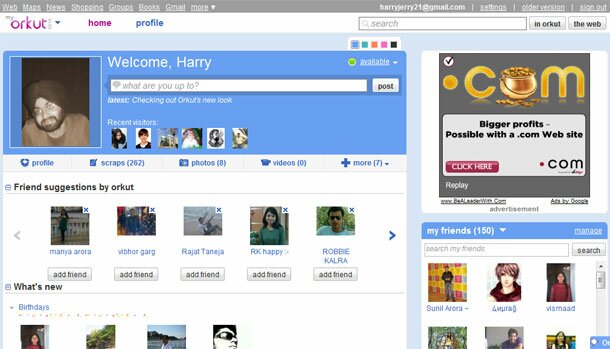
Orkut recently started inviting members to try out it’s new design. I’ve been using it for the past one week, long enough to write a review. Orkut is currently India’s most popular social networking site as per statistics. Facebook is one step behind but I have a feeling it’ll catch up pretty soon. Orkut’s redesign might act as a catalyst. Yes I said that.
I feel Orkut’s previous design was way better organized than the current one. The new design makes Orkut more Hi5-ish. In an attempt to simplify the interface Orkut has failed miserably.

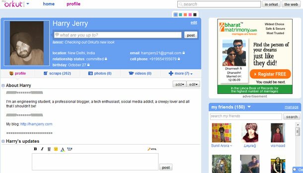
The new profile page features Facebook like update capabilities. It displays updates, scraps etc. right there. The ugly clutter will make you wanna sign off asap.
If you look closely at the profile page:

It’s an obvious attempt at Facebook’s feed based interface. Now Orkut isn’t getting any points there.
Orkut’s new design is currently said to be in development stages and is available only on an invitation basis. I have 10 invitations to share but I don’t think you’d wanna try it out for yourself.
On the whole a very weak attempt from Orkut’s side. The interface is nowhere close to the optimum level. The whole look reminds me of those school-day-Hi5-craze. Those were the days we’d tolerate clutter for a small amount of networking. Not now. No way! I’ll suggest you guys move to Facebook for a better experience.
|
|
Tags: facebook, Google, hi5, orkut, profile, redesign, reviews, social networking

